> ## Documentation Index
> Fetch the complete documentation index at: https://docs.dodopayments.com/llms.txt
> Use this file to discover all available pages before exploring further.
# Design & Theme Customization
> Customize the look and feel of your checkout, storefront, and customer portal from one place. Choose pre-built themes, configure typography and colors, and apply per-section overrides, all with live preview.
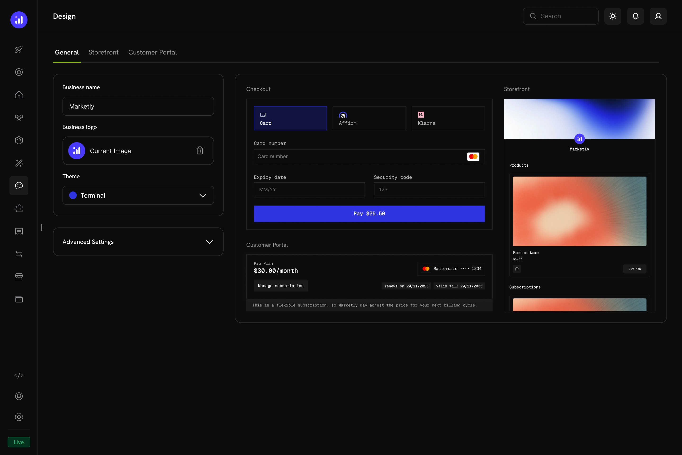 The Design page is your central hub for branding every customer-facing surface: checkout, storefront, and customer portal. Changes apply instantly across all three and are previewed in real time before you save. Test mode and live mode hold separate designs — see [Copy Design From Test to Live Mode](#copy-design-from-test-to-live-mode).
## Key Highlights
* **Unified Design Hub** — Configure checkout, storefront, and customer portal appearance from a single page
* **Pre-Built Themes** — Start with a curated theme and customize from there
* **Light & Dark Mode** — Define separate color palettes for each mode
* **Live Preview** — See how your changes look across all surfaces before saving
* **Per-Section Overrides** — Fine-tune individual sections without affecting the others
* **Programmatic Control** — Override themes at checkout time via the Checkout Sessions API (`customization.theme_config`). A session's `theme_config` takes precedence over the dashboard design. The Checkout SDK's client-side `themeConfig` option is deprecated
* **Copy Test Design to Live** — Move a design you perfected in test mode into live mode in one step
## Getting Started
Navigate to **Settings → Design** in your Merchant Dashboard. The Design page has four tabs:
| Tab | Purpose |
| :- | :- |
| **General** | Business name, logo, theme selection, and global advanced settings |
| **Checkout** | Override theme settings specifically for the checkout page |
| **Storefront** | Override theme settings and configure storefront layout |
| **Customer Portal** | Override theme settings for the customer portal |
## General Settings
The **General** tab controls your baseline brand identity and global theme.
The Design page is your central hub for branding every customer-facing surface: checkout, storefront, and customer portal. Changes apply instantly across all three and are previewed in real time before you save. Test mode and live mode hold separate designs — see [Copy Design From Test to Live Mode](#copy-design-from-test-to-live-mode).
## Key Highlights
* **Unified Design Hub** — Configure checkout, storefront, and customer portal appearance from a single page
* **Pre-Built Themes** — Start with a curated theme and customize from there
* **Light & Dark Mode** — Define separate color palettes for each mode
* **Live Preview** — See how your changes look across all surfaces before saving
* **Per-Section Overrides** — Fine-tune individual sections without affecting the others
* **Programmatic Control** — Override themes at checkout time via the Checkout Sessions API (`customization.theme_config`). A session's `theme_config` takes precedence over the dashboard design. The Checkout SDK's client-side `themeConfig` option is deprecated
* **Copy Test Design to Live** — Move a design you perfected in test mode into live mode in one step
## Getting Started
Navigate to **Settings → Design** in your Merchant Dashboard. The Design page has four tabs:
| Tab | Purpose |
| :- | :- |
| **General** | Business name, logo, theme selection, and global advanced settings |
| **Checkout** | Override theme settings specifically for the checkout page |
| **Storefront** | Override theme settings and configure storefront layout |
| **Customer Portal** | Override theme settings for the customer portal |
## General Settings
The **General** tab controls your baseline brand identity and global theme.
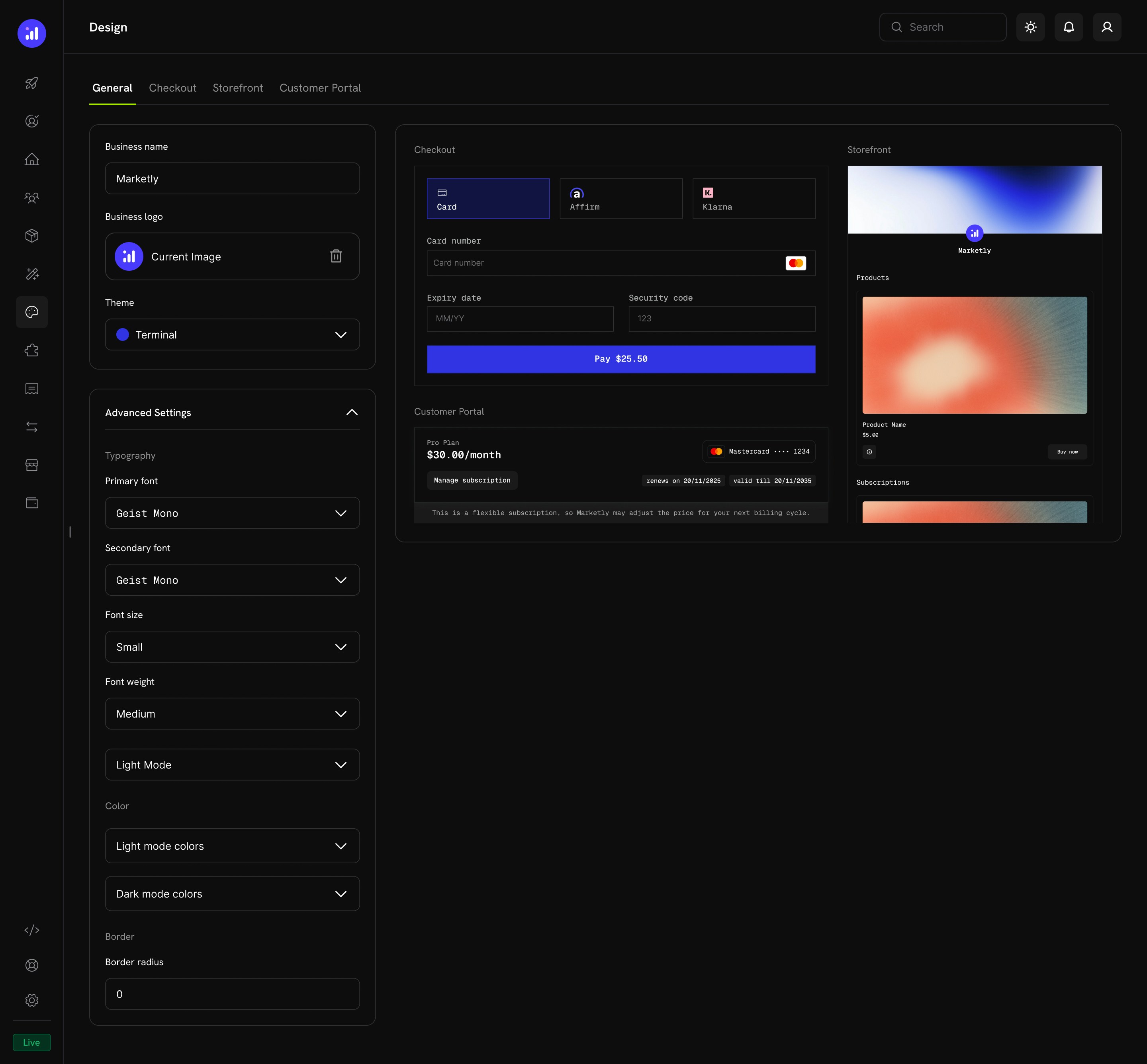 ### Basic Configuration
| Setting | Description |
| :- | :- |
| **Business Name** | The name displayed on checkout, storefront, and customer portal |
| **Business Logo** | Your brand logo shown across all customer-facing pages |
| **Theme** | Select a pre-built theme as your starting point |
### Advanced Settings
Expand **Advanced Settings** to access granular controls:
### Basic Configuration
| Setting | Description |
| :- | :- |
| **Business Name** | The name displayed on checkout, storefront, and customer portal |
| **Business Logo** | Your brand logo shown across all customer-facing pages |
| **Theme** | Select a pre-built theme as your starting point |
### Advanced Settings
Expand **Advanced Settings** to access granular controls:
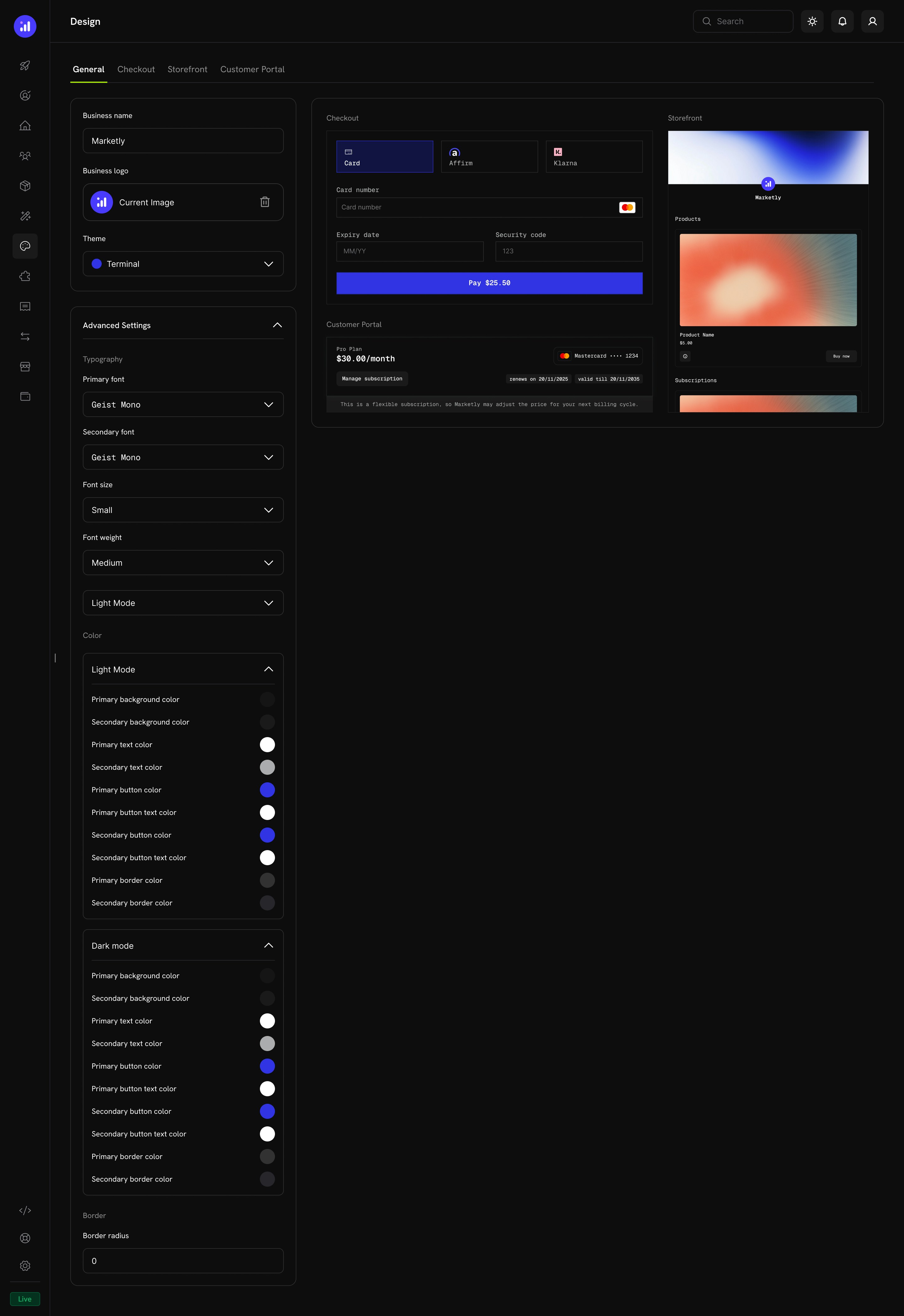 #### Typography
| Setting | Options | Description |
| :- | :- | :- |
| **Primary Font** | Any Google Font | Main font for headings and body text |
| **Secondary Font** | Any Google Font | Accent font for labels and secondary text |
| **Font Size** | `xs`, `sm`, `md`, `lg`, `xl`, `2xl` | Global base font size |
| **Font Weight** | `normal`, `medium`, `bold`, `extraBold` | Default font weight |
#### Color Configuration
Define separate color palettes for **Light Mode** and **Dark Mode**. Each mode supports:
| Property | Description |
| :- | :- |
| **Background Primary** | Main background color |
| **Background Secondary** | Secondary background (tabs, cards) |
| **Text Primary** | Main text color |
| **Text Secondary** | Muted text color |
| **Button Primary** | Primary button background |
| **Button Primary Text** | Text color on primary buttons |
| **Button Secondary** | Secondary button background |
| **Button Secondary Text** | Text color on secondary buttons |
| **Border Primary** | Main border color |
| **Border Secondary** | Accent border color |
#### Border
| Setting | Description |
| :- | :- |
| **Border Radius** | Controls the roundness of inputs, buttons, tabs, and cards (e.g., `0` for sharp corners, `8px` for rounded, `16px` for pill-shaped) |
## Pre-Built Themes
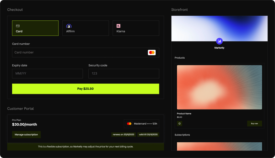
Dodo Payments ships with four curated themes. Select one from the **Theme** dropdown on the General tab to instantly apply a cohesive design across checkout, storefront, and customer portal.
### Dodo Pulses
The default Dodo Payments theme. Lime green accents give it an energetic, fresh feel. Clean sans-serif typography with generous spacing.
#### Typography
| Setting | Options | Description |
| :- | :- | :- |
| **Primary Font** | Any Google Font | Main font for headings and body text |
| **Secondary Font** | Any Google Font | Accent font for labels and secondary text |
| **Font Size** | `xs`, `sm`, `md`, `lg`, `xl`, `2xl` | Global base font size |
| **Font Weight** | `normal`, `medium`, `bold`, `extraBold` | Default font weight |
#### Color Configuration
Define separate color palettes for **Light Mode** and **Dark Mode**. Each mode supports:
| Property | Description |
| :- | :- |
| **Background Primary** | Main background color |
| **Background Secondary** | Secondary background (tabs, cards) |
| **Text Primary** | Main text color |
| **Text Secondary** | Muted text color |
| **Button Primary** | Primary button background |
| **Button Primary Text** | Text color on primary buttons |
| **Button Secondary** | Secondary button background |
| **Button Secondary Text** | Text color on secondary buttons |
| **Border Primary** | Main border color |
| **Border Secondary** | Accent border color |
#### Border
| Setting | Description |
| :- | :- |
| **Border Radius** | Controls the roundness of inputs, buttons, tabs, and cards (e.g., `0` for sharp corners, `8px` for rounded, `16px` for pill-shaped) |
## Pre-Built Themes
Dodo Payments ships with four curated themes. Select one from the **Theme** dropdown on the General tab to instantly apply a cohesive design across checkout, storefront, and customer portal.
### Dodo Pulses
The default Dodo Payments theme. Lime green accents give it an energetic, fresh feel. Clean sans-serif typography with generous spacing.
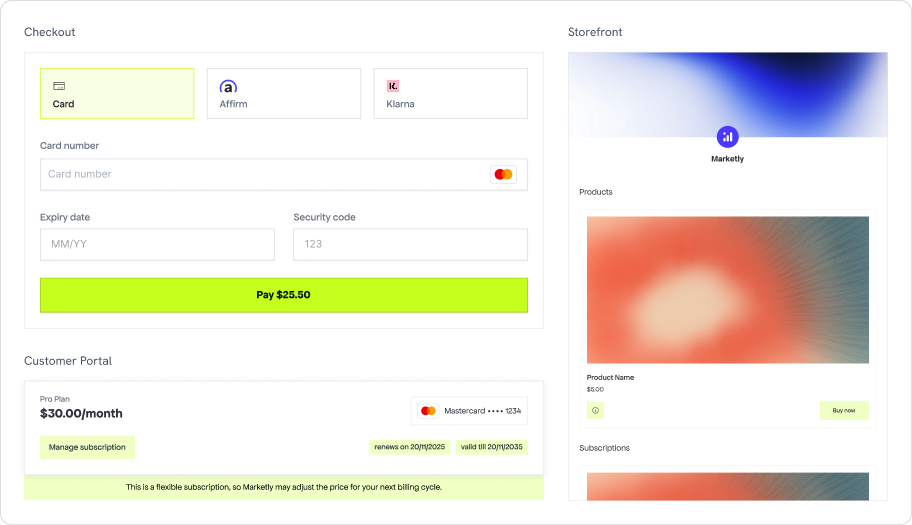
 ### Terminal
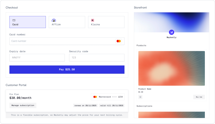
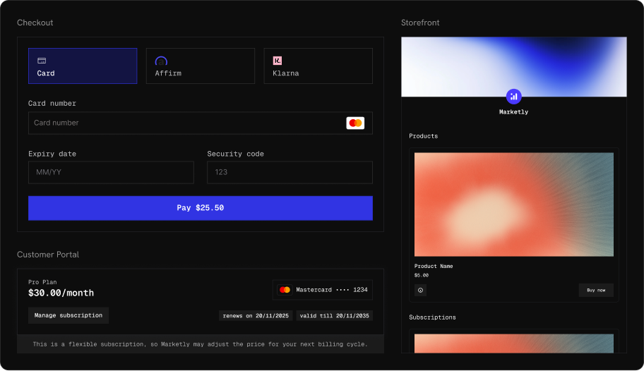
A developer-oriented theme with monospaced typography and royal blue accents. Sharp corners and a technical aesthetic that pairs well with dev-tool and API-first products.
### Terminal
A developer-oriented theme with monospaced typography and royal blue accents. Sharp corners and a technical aesthetic that pairs well with dev-tool and API-first products.
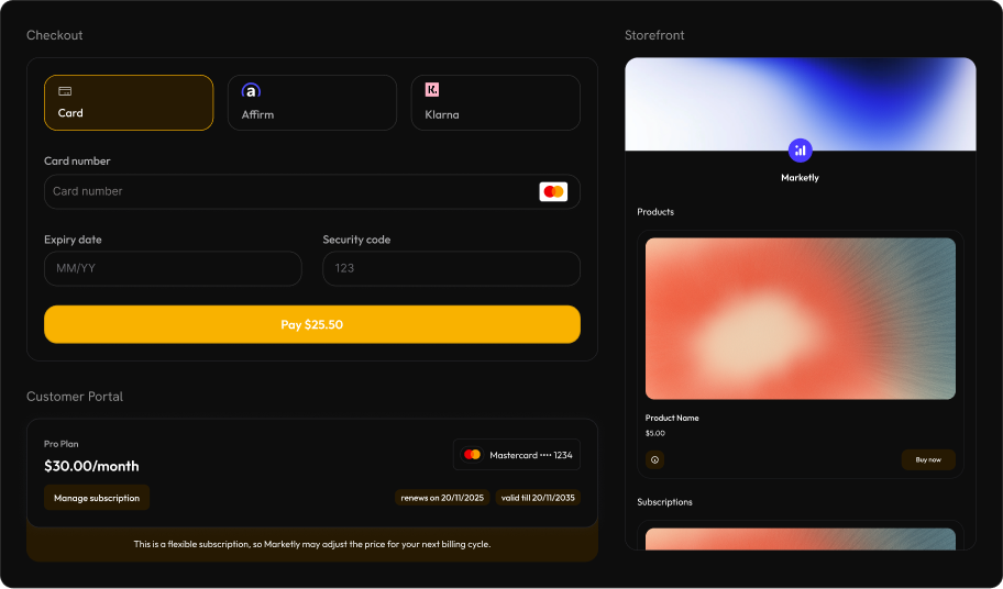
 ### Bumblebee
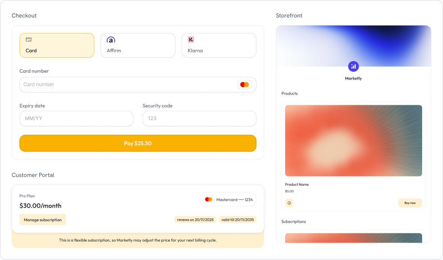
Warm amber and gold accents with rounded, modern styling. Bold and high-contrast, well-suited for consumer-facing products that want to feel premium.
### Bumblebee
Warm amber and gold accents with rounded, modern styling. Bold and high-contrast, well-suited for consumer-facing products that want to feel premium.
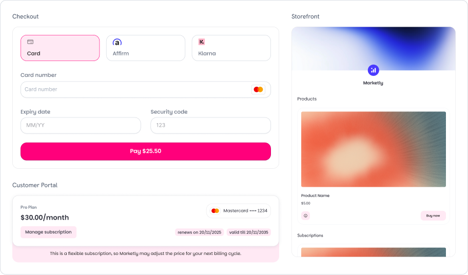
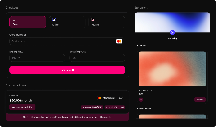
 ### Bubblegum
Playful pink and magenta accents with fully rounded corners. A modern, approachable look that works great for creative tools, design products, and lifestyle brands.
### Bubblegum
Playful pink and magenta accents with fully rounded corners. A modern, approachable look that works great for creative tools, design products, and lifestyle brands.
 After selecting a pre-built theme, customize individual properties in Advanced Settings. Any unspecified properties fall back to the theme defaults.
## Per-Section Overrides
Each section tab (Checkout, Storefront, Customer Portal) includes an **Override Theme** toggle. When enabled, you can customize that section's appearance independently from the global theme.
### Checkout Tab
After selecting a pre-built theme, customize individual properties in Advanced Settings. Any unspecified properties fall back to the theme defaults.
## Per-Section Overrides
Each section tab (Checkout, Storefront, Customer Portal) includes an **Override Theme** toggle. When enabled, you can customize that section's appearance independently from the global theme.
### Checkout Tab
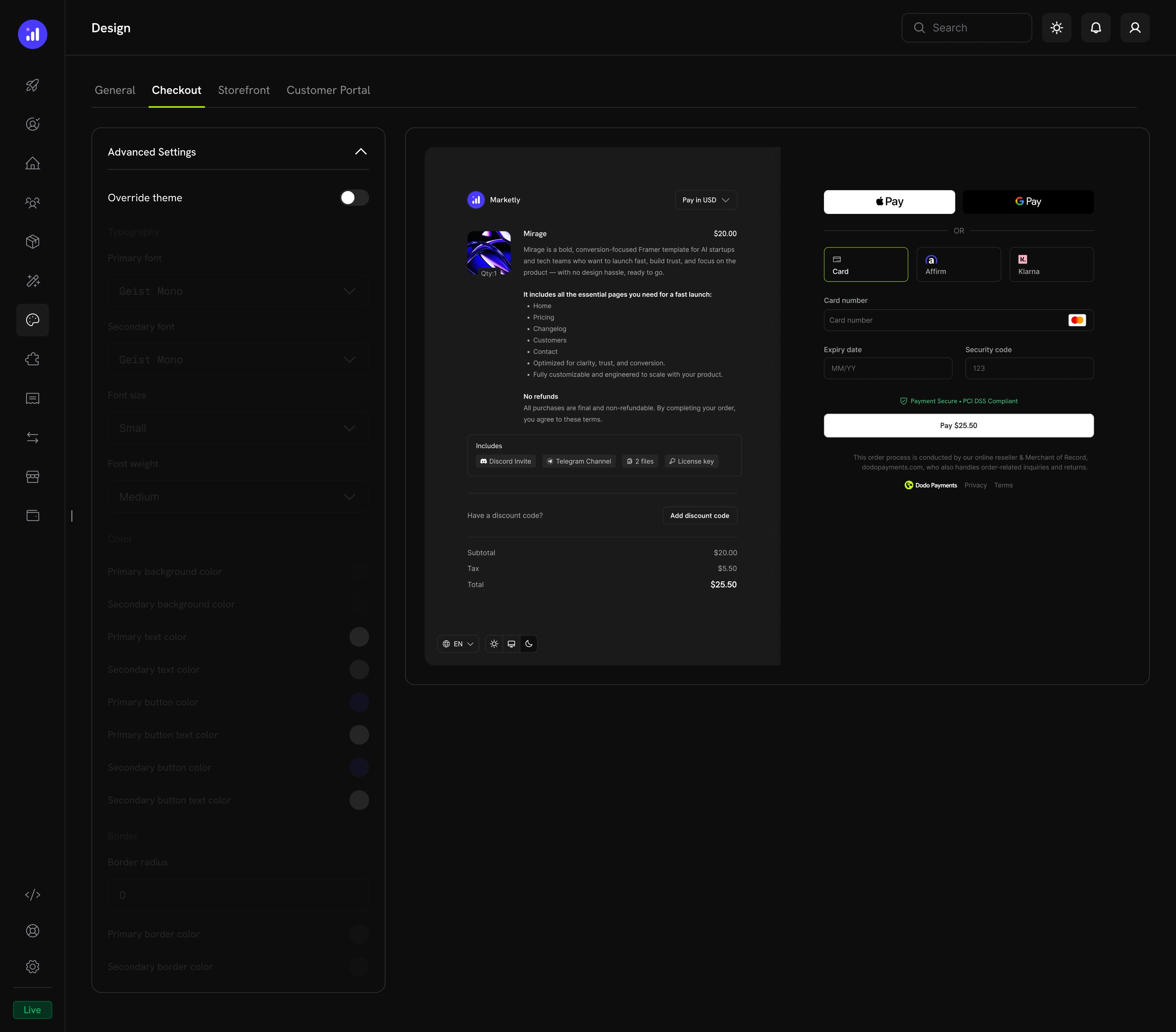 Override typography, colors, and border settings specifically for the checkout experience. The live preview shows:
* Product information and pricing
* Express checkout options (Apple Pay, Google Pay)
* Payment method selection and card form
* Discount code input and price breakdown
### Storefront Tab
Override typography, colors, and border settings specifically for the checkout experience. The live preview shows:
* Product information and pricing
* Express checkout options (Apple Pay, Google Pay)
* Payment method selection and card form
* Discount code input and price breakdown
### Storefront Tab
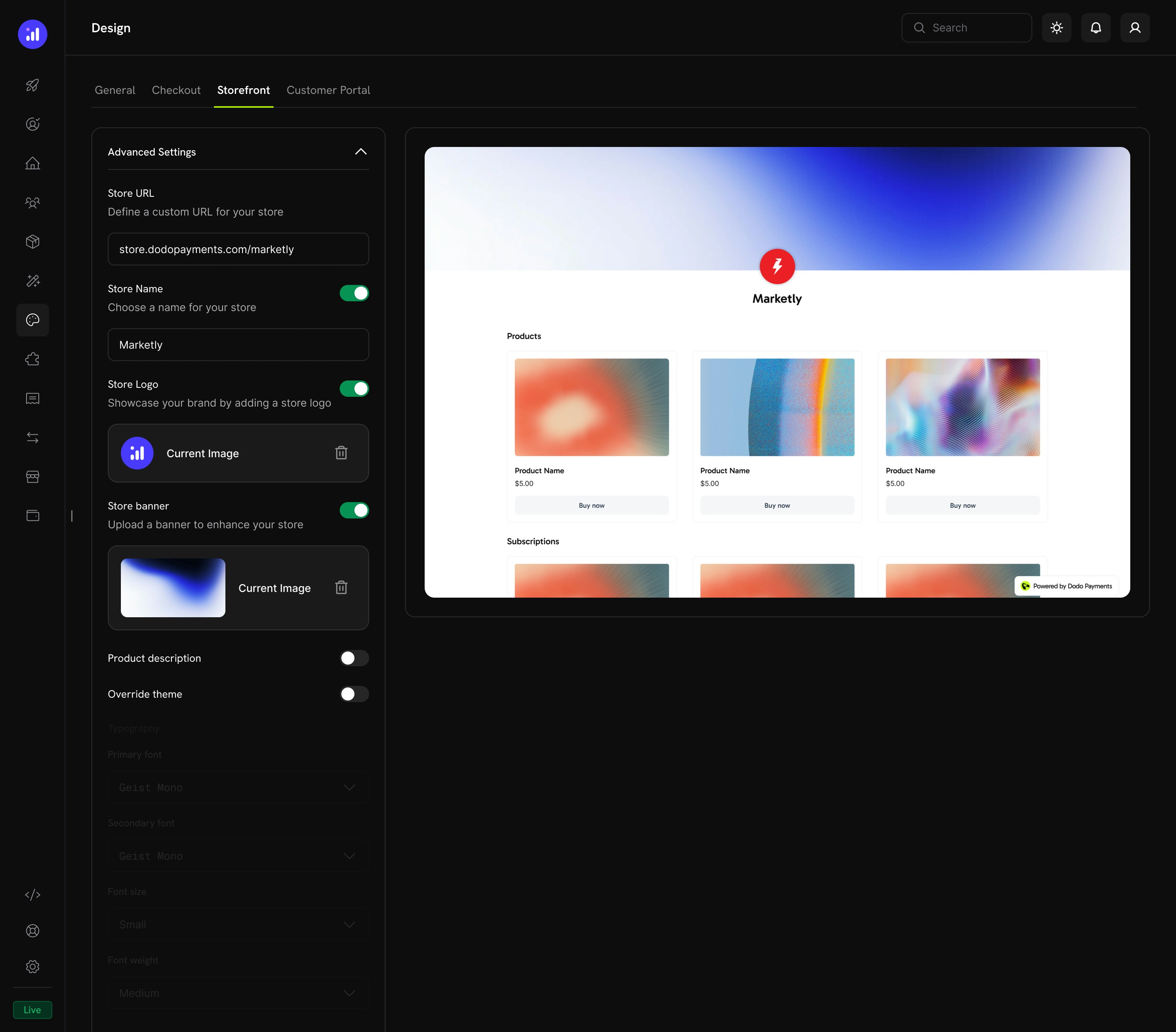 Configure storefront-specific settings:
| Setting | Description |
| :- | :- |
| **Store URL** | Your storefront address (e.g., `store.dodopayments.com/your-store`) |
| **Store Name** | Toggle and set the name displayed on your storefront |
| **Store Logo** | Toggle and upload a logo for the storefront header |
| **Store Banner** | Toggle and upload a banner image |
| **Product Description** | Toggle to show or hide product descriptions on cards |
| **Override Theme** | Enable to customize typography, colors, and borders for the storefront only |
### Customer Portal Tab
Configure storefront-specific settings:
| Setting | Description |
| :- | :- |
| **Store URL** | Your storefront address (e.g., `store.dodopayments.com/your-store`) |
| **Store Name** | Toggle and set the name displayed on your storefront |
| **Store Logo** | Toggle and upload a logo for the storefront header |
| **Store Banner** | Toggle and upload a banner image |
| **Product Description** | Toggle to show or hide product descriptions on cards |
| **Override Theme** | Enable to customize typography, colors, and borders for the storefront only |
### Customer Portal Tab
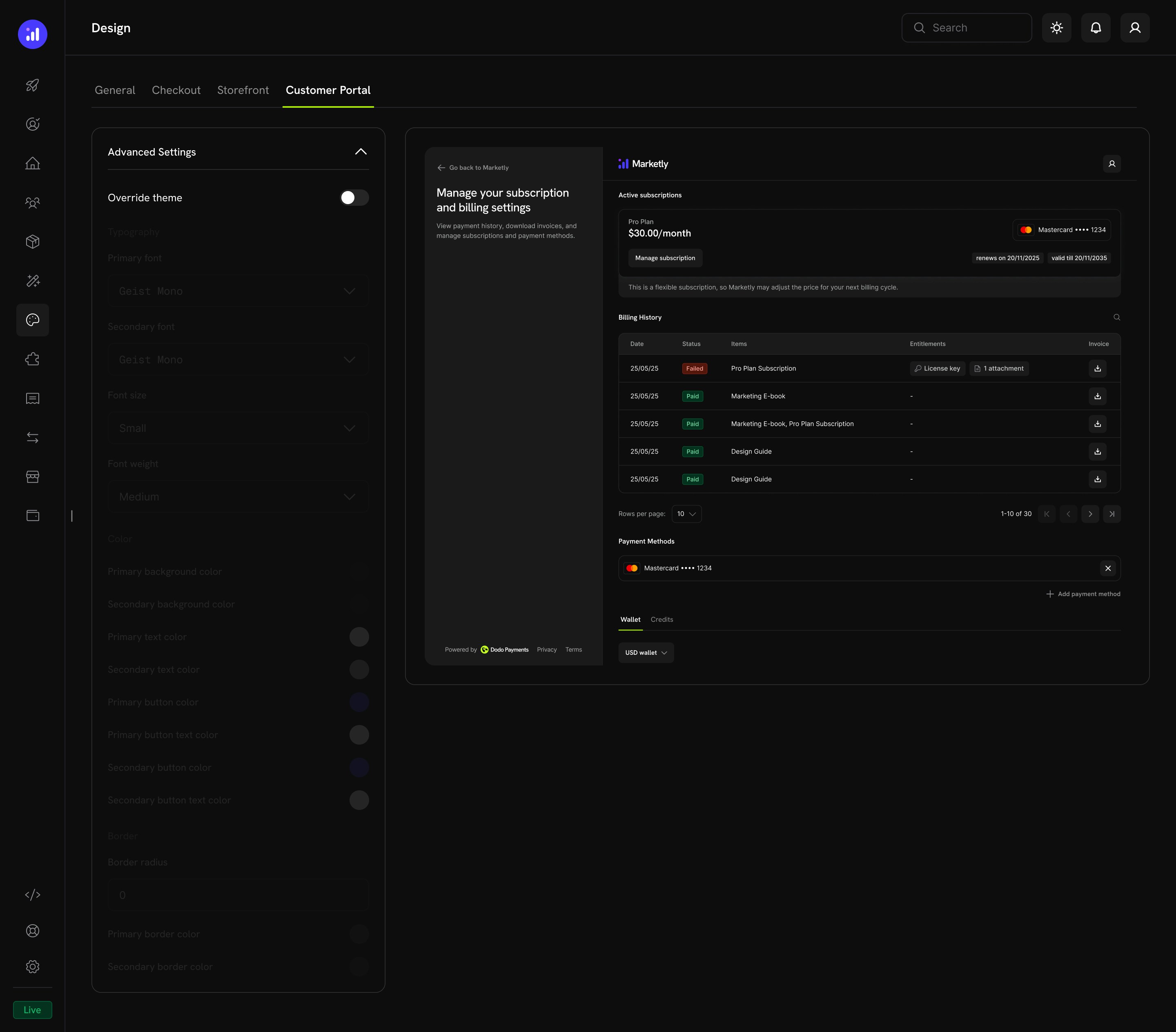 Override the theme for the customer portal, which includes:
* Subscription management
* Billing history
* Payment methods
* Wallet and credits
## Copy Design From Test to Live Mode
Test mode and live mode keep separate design configurations. A theme you build while testing does not automatically appear to real customers. Instead of re-creating it by hand, copy your design from test mode to live mode in one step.
Switch to test mode and go to **Settings → Design**. Save any pending changes first: only the saved test design is copied.
Click **Copy to Live Mode**. The button appears once you have a saved theme or a published test storefront, and live mode must be activated.
Select **Theme & customizations** (the general theme plus checkout, storefront, and Customer Portal overrides) and **Storefront details** (store name, logo, and banner). Storefront details is unavailable if no storefront is published in test mode.
Click **Copy to Live Mode** in the dialog.
Copying overwrites the existing live mode design. Review your live checkout and storefront after copying to confirm everything looks the way you expect.
## Related Pages
Checkout features including currency, language, tax, discounts, and more.
Embed checkout as a modal overlay on your page.
Embed checkout directly into your page layout.
Set up and manage your branded storefront.
Customer self-service portal for subscriptions and billing.
Run multiple brands under one account with separate branding.
This documentation is built and hosted on [Mintlify](https://mintlify.com), a developer documentation platform.
Override the theme for the customer portal, which includes:
* Subscription management
* Billing history
* Payment methods
* Wallet and credits
## Copy Design From Test to Live Mode
Test mode and live mode keep separate design configurations. A theme you build while testing does not automatically appear to real customers. Instead of re-creating it by hand, copy your design from test mode to live mode in one step.
Switch to test mode and go to **Settings → Design**. Save any pending changes first: only the saved test design is copied.
Click **Copy to Live Mode**. The button appears once you have a saved theme or a published test storefront, and live mode must be activated.
Select **Theme & customizations** (the general theme plus checkout, storefront, and Customer Portal overrides) and **Storefront details** (store name, logo, and banner). Storefront details is unavailable if no storefront is published in test mode.
Click **Copy to Live Mode** in the dialog.
Copying overwrites the existing live mode design. Review your live checkout and storefront after copying to confirm everything looks the way you expect.
## Related Pages
Checkout features including currency, language, tax, discounts, and more.
Embed checkout as a modal overlay on your page.
Embed checkout directly into your page layout.
Set up and manage your branded storefront.
Customer self-service portal for subscriptions and billing.
Run multiple brands under one account with separate branding.
This documentation is built and hosted on [Mintlify](https://mintlify.com), a developer documentation platform.