

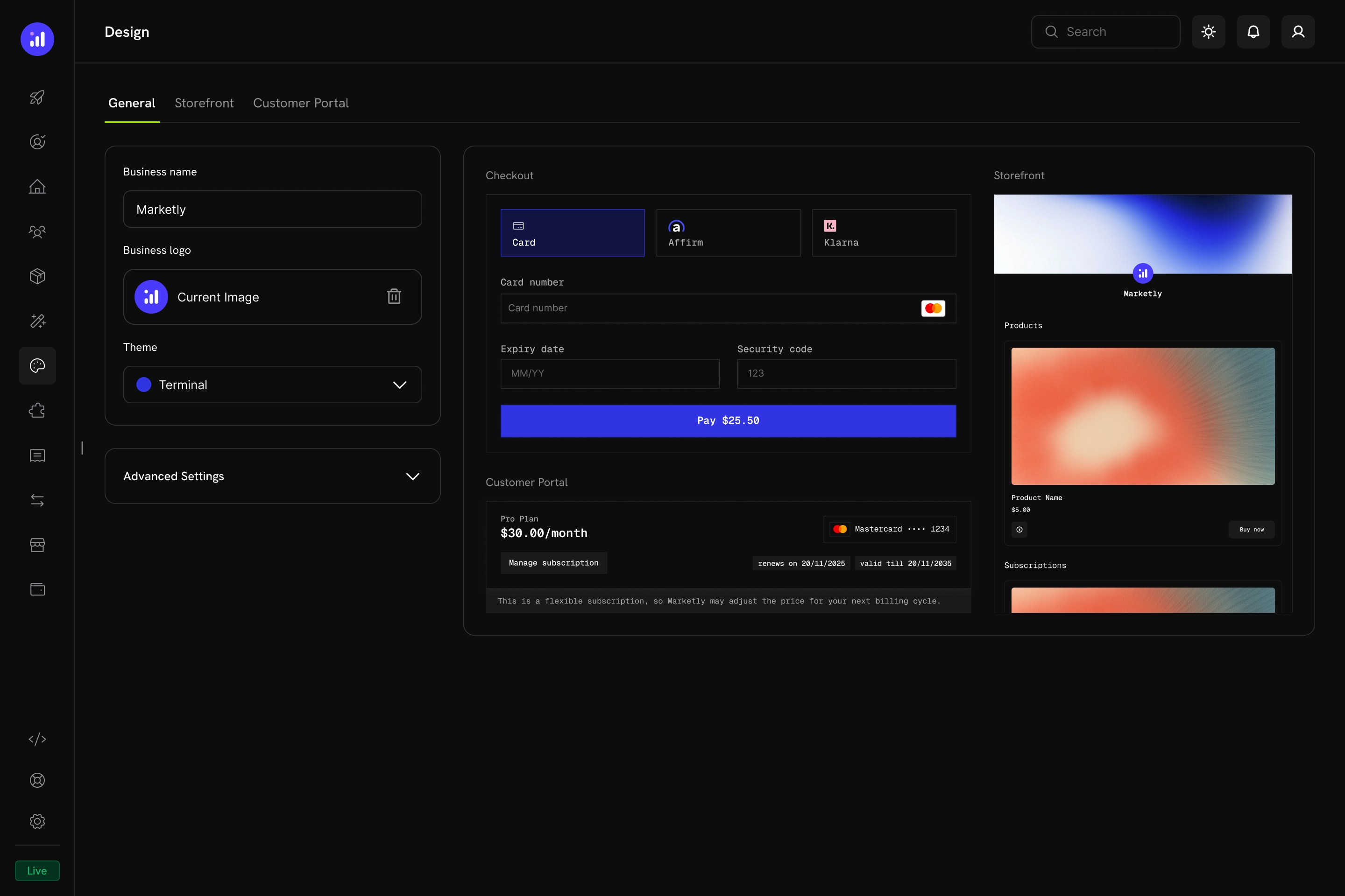
Key Highlights
- Unified Design Hub — Configure checkout, storefront, and customer portal appearance from a single page
- Pre-Built Themes — Start with a curated theme and customize from there
- Light & Dark Mode — Define separate color palettes for each mode
- Live Preview — See how your changes look across all surfaces before saving
- Per-Section Overrides — Fine-tune individual sections without affecting the others
- Programmatic Control — Override themes at checkout time via the Checkout Sessions API (
customization.theme_config). A session’stheme_configtakes precedence over the dashboard design. The Checkout SDK’s client-sidethemeConfigoption is deprecated - Copy Test Design to Live — Move a design you perfected in test mode into live mode in one step
Getting Started
Navigate to Settings → Design in your Merchant Dashboard. The Design page has four tabs:General Settings
The General tab controls your baseline brand identity and global theme.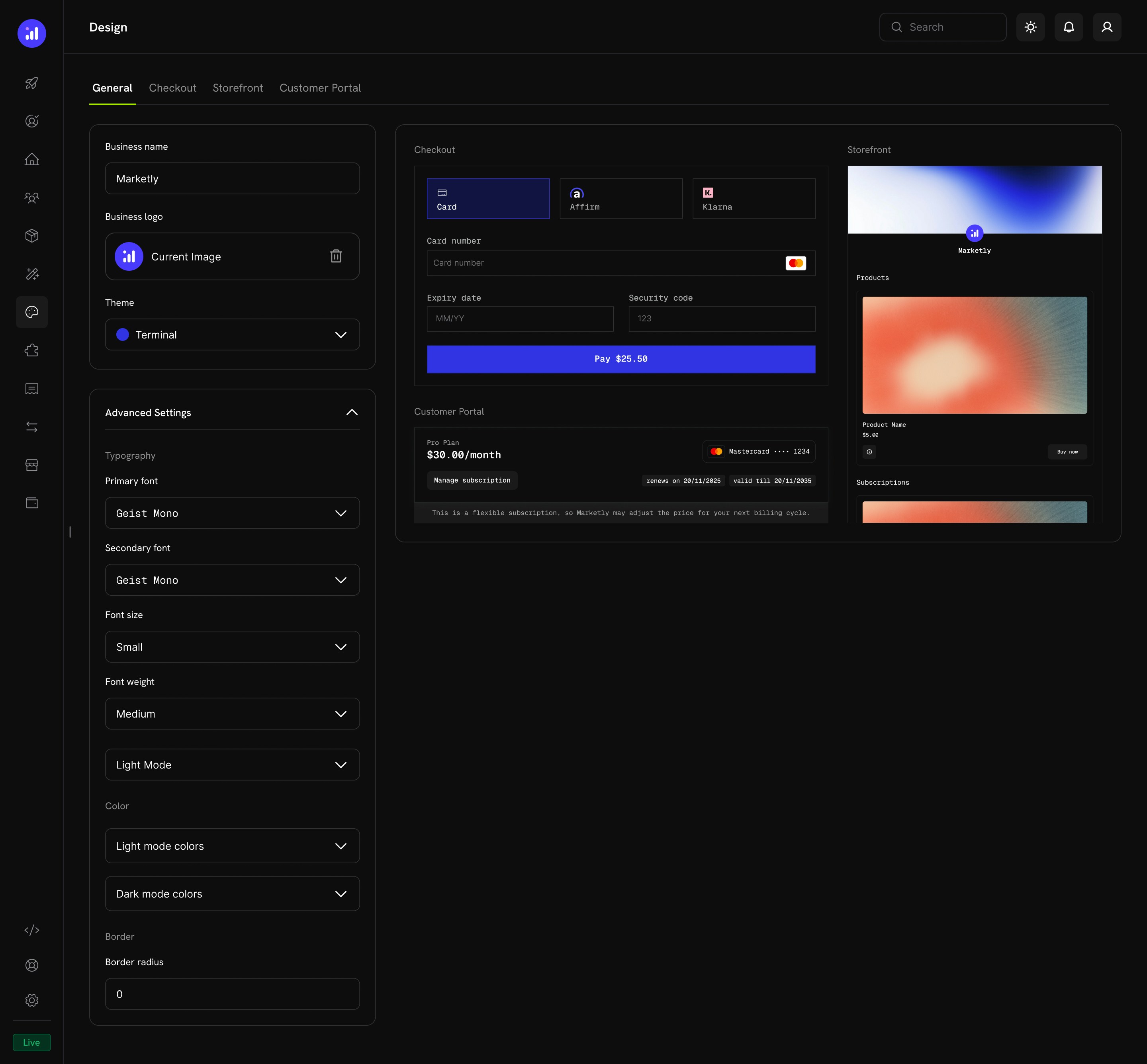
Basic Configuration
Advanced Settings
Expand Advanced Settings to access granular controls: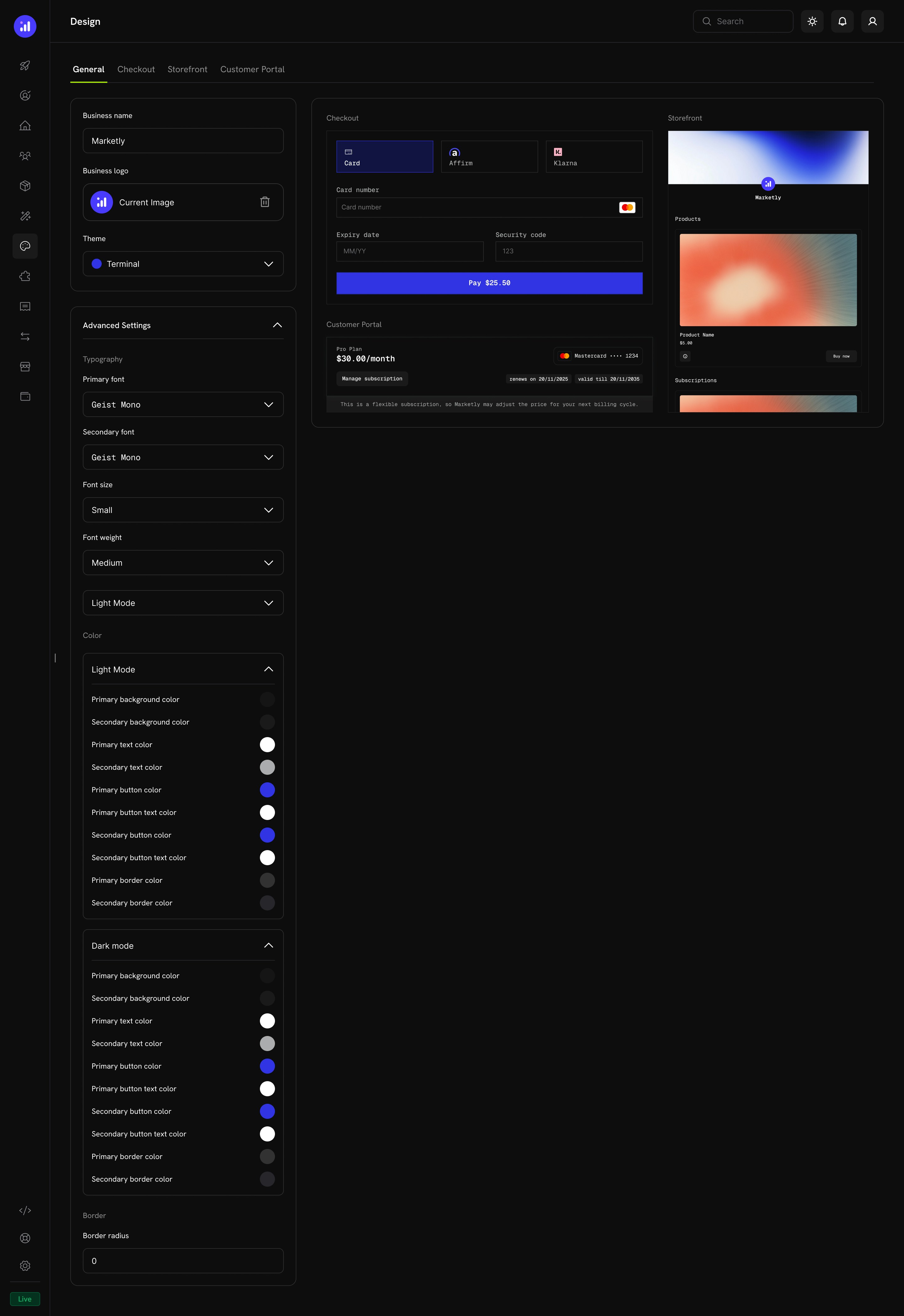
Typography
Color Configuration
Define separate color palettes for Light Mode and Dark Mode. Each mode supports:Border
Pre-Built Themes
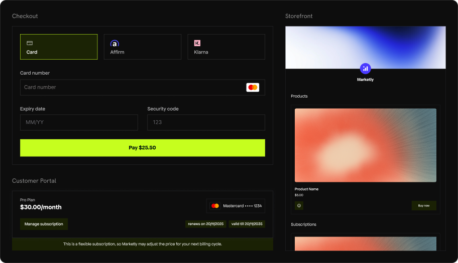
Dodo Payments ships with four curated themes. Select one from the Theme dropdown on the General tab to instantly apply a cohesive design across checkout, storefront, and customer portal.Dodo Pulses
The default Dodo Payments theme. Lime green accents give it an energetic, fresh feel. Clean sans-serif typography with generous spacing.- Light Mode
- Dark Mode
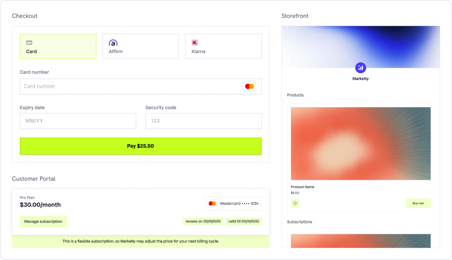
Dodo Pulses in light mode
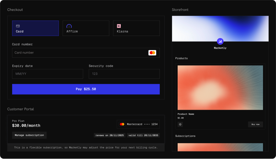
Terminal
A developer-oriented theme with monospaced typography and royal blue accents. Sharp corners and a technical aesthetic that pairs well with dev-tool and API-first products.- Light Mode
- Dark Mode
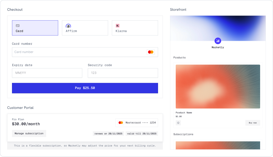
Terminal in light mode
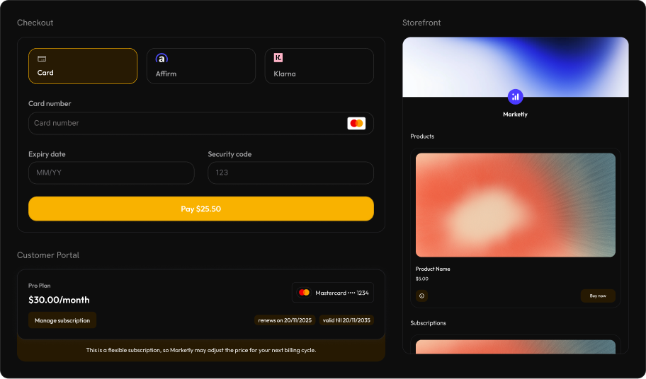
Bumblebee
Warm amber and gold accents with rounded, modern styling. Bold and high-contrast, well-suited for consumer-facing products that want to feel premium.- Light Mode
- Dark Mode
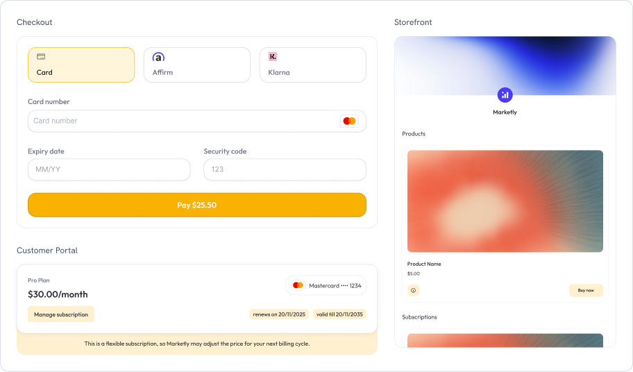
Bumblebee in light mode
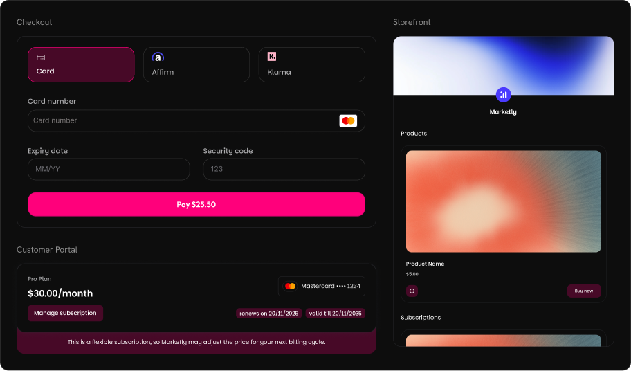
Bubblegum
Playful pink and magenta accents with fully rounded corners. A modern, approachable look that works great for creative tools, design products, and lifestyle brands.- Light Mode
- Dark Mode
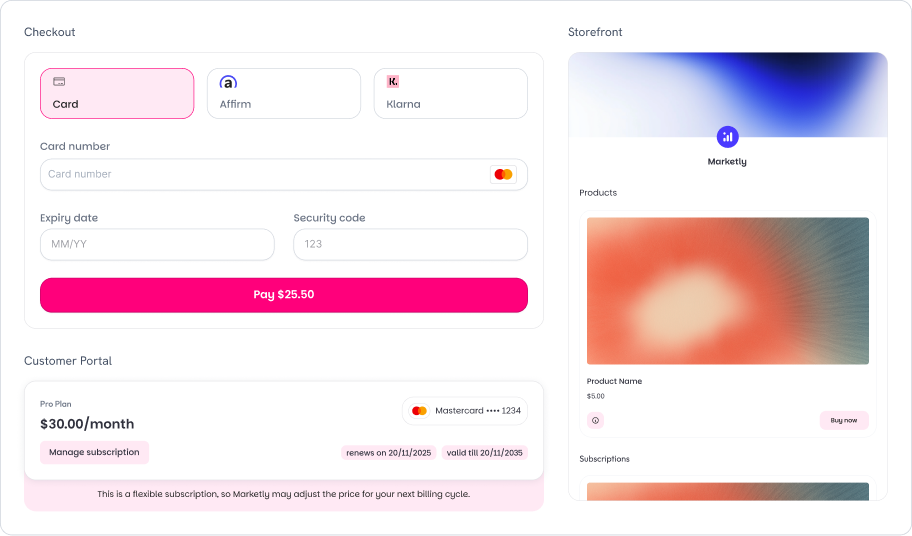
Bubblegum in light mode
Per-Section Overrides
Each section tab (Checkout, Storefront, Customer Portal) includes an Override Theme toggle. When enabled, you can customize that section’s appearance independently from the global theme.Checkout Tab
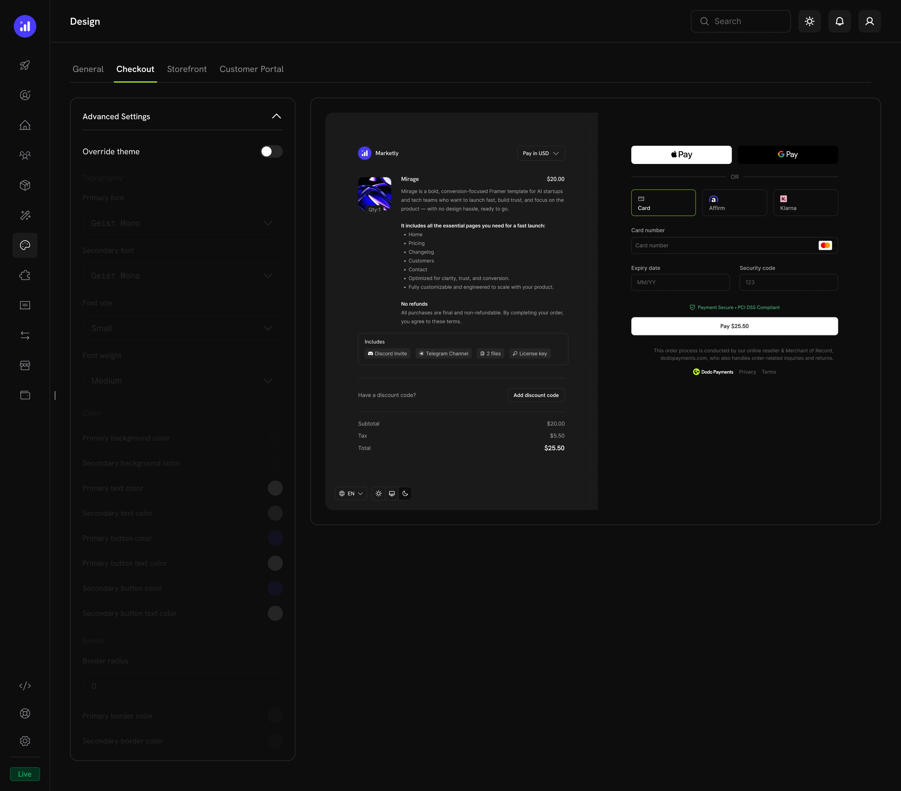
- Product information and pricing
- Express checkout options (Apple Pay, Google Pay)
- Payment method selection and card form
- Discount code input and price breakdown
Storefront Tab
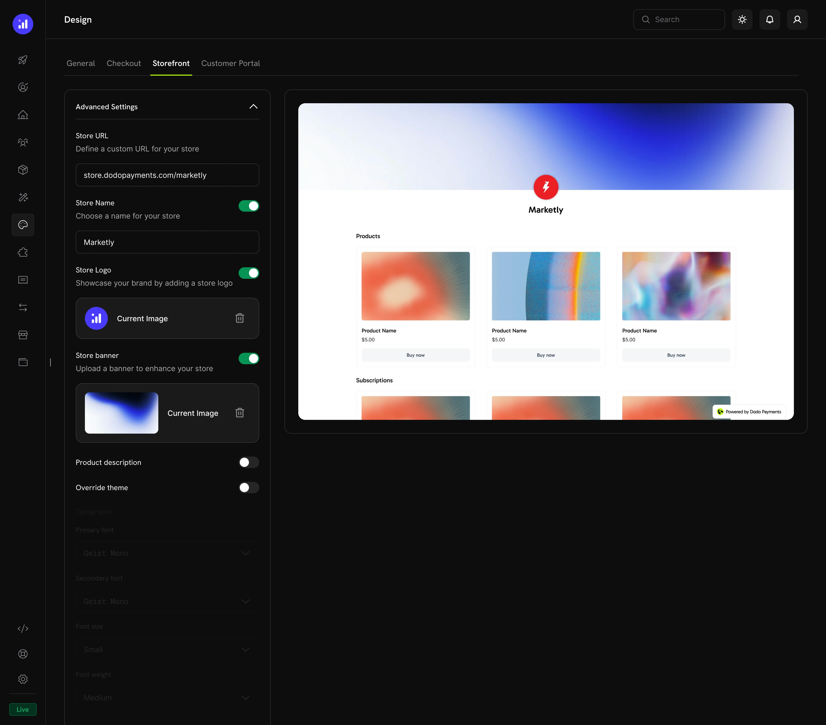
Customer Portal Tab
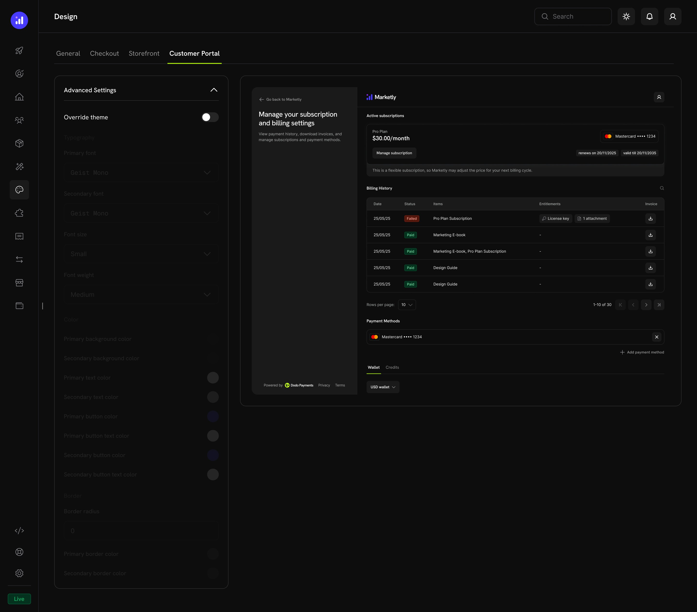
- Subscription management
- Billing history
- Payment methods
- Wallet and credits
Copy Design From Test to Live Mode
Test mode and live mode keep separate design configurations. A theme you build while testing does not automatically appear to real customers. Instead of re-creating it by hand, copy your design from test mode to live mode in one step.1
Open Design in Test Mode
Switch to test mode and go to Settings → Design. Save any pending changes first: only the saved test design is copied.
2
Start the Copy
Click Copy to Live Mode. The button appears once you have a saved theme or a published test storefront, and live mode must be activated.
3
Choose What to Copy
Select Theme & customizations (the general theme plus checkout, storefront, and Customer Portal overrides) and Storefront details (store name, logo, and banner). Storefront details is unavailable if no storefront is published in test mode.
4
Confirm
Click Copy to Live Mode in the dialog.
Related Pages
Checkout Features
Checkout features including currency, language, tax, discounts, and more.
Overlay Checkout SDK
Embed checkout as a modal overlay on your page.
Inline Checkout SDK
Embed checkout directly into your page layout.
Storefront
Set up and manage your branded storefront.
Customer Portal
Customer self-service portal for subscriptions and billing.
Multi-Brand Setup
Run multiple brands under one account with separate branding.